CARD & PACKAGING
N26 Metal
N26 Metal
In 2018, I created the first contactless metal card portfolio in Europe, introducing both a physical and digital lifestyle product for an affluent sub-audience. I took a lead role from concepting, packaging, production to partnership management and product positioning.
In 2018, I created the first contactless metal card portfolio in Europe, introducing both a physical and digital lifestyle product for an affluent sub-audience. I took a lead role from concepting, packaging, production to partnership management and product positioning.
PROJECT INFO
INTRODUCTION
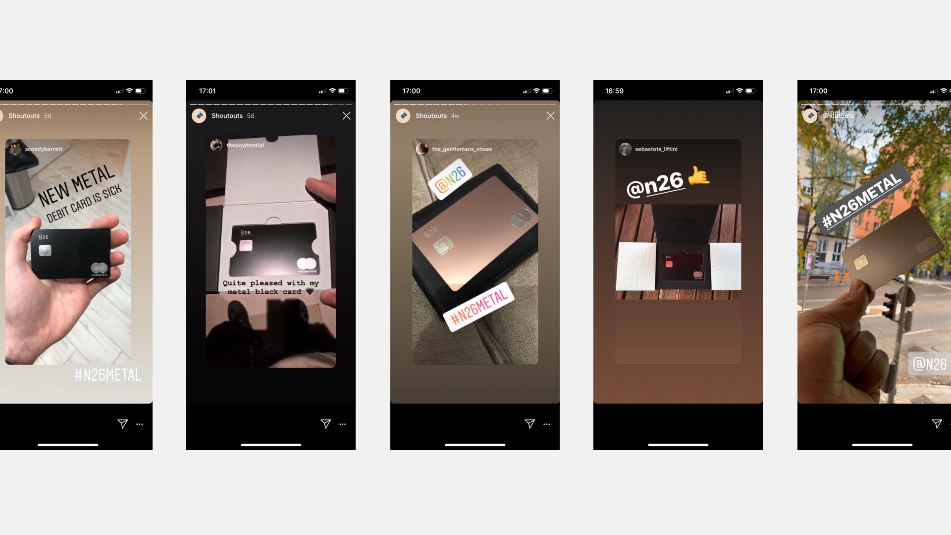
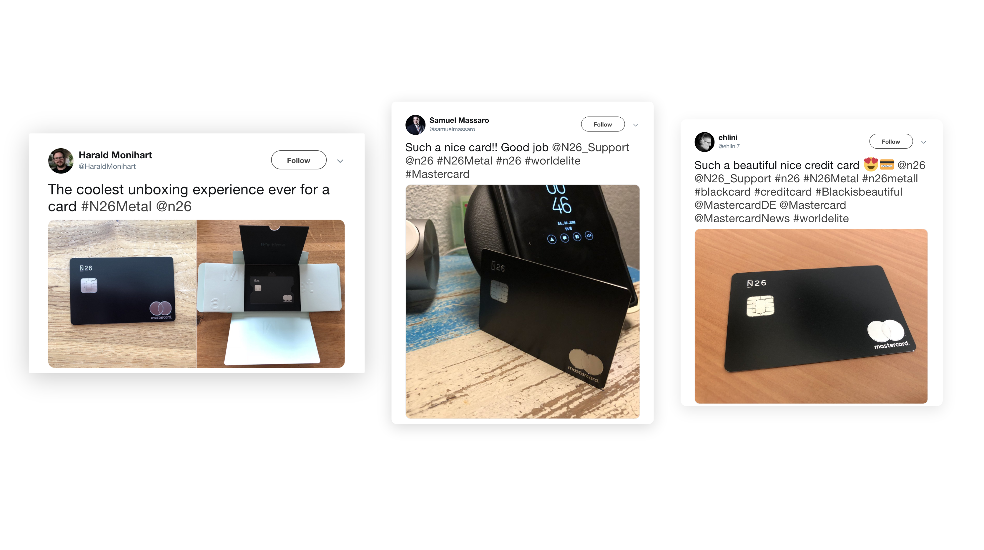
The decision to introduce N26 Metal was rooted in the research from our N26 Black product. The success of N26 Black showed an emerging market segment who associate with higher-end lifestyle brands, travelled often and were interested in the peace of mind that a premium product provides.
- Product Positioning & Naming
- Brainstorming Ideation
- Card and Packaging supplier RFPs
- Sampling
- Creative Development
- Implementation
- Results
CREATIVE TEAM
DESIGN LEAD: TARYN NIESENA
DESIGNER: GREER CHAPMAN
PHOTOGRAPHY: LENA SMIRNOVA
MOTION DESIGN: JUAN GARCÍA SEGURA
CARD SUPPLIER: COMPOSECURE
PACKAGING SUPPLIER: PROGRESS
DISCIPLINES
CONCEPT / PACKAGING / ART DIRECTION / PARTNERSHIP MANAGEMENT / CARD DESIGN / PRODUCT POSITIONING / OPERATIONS
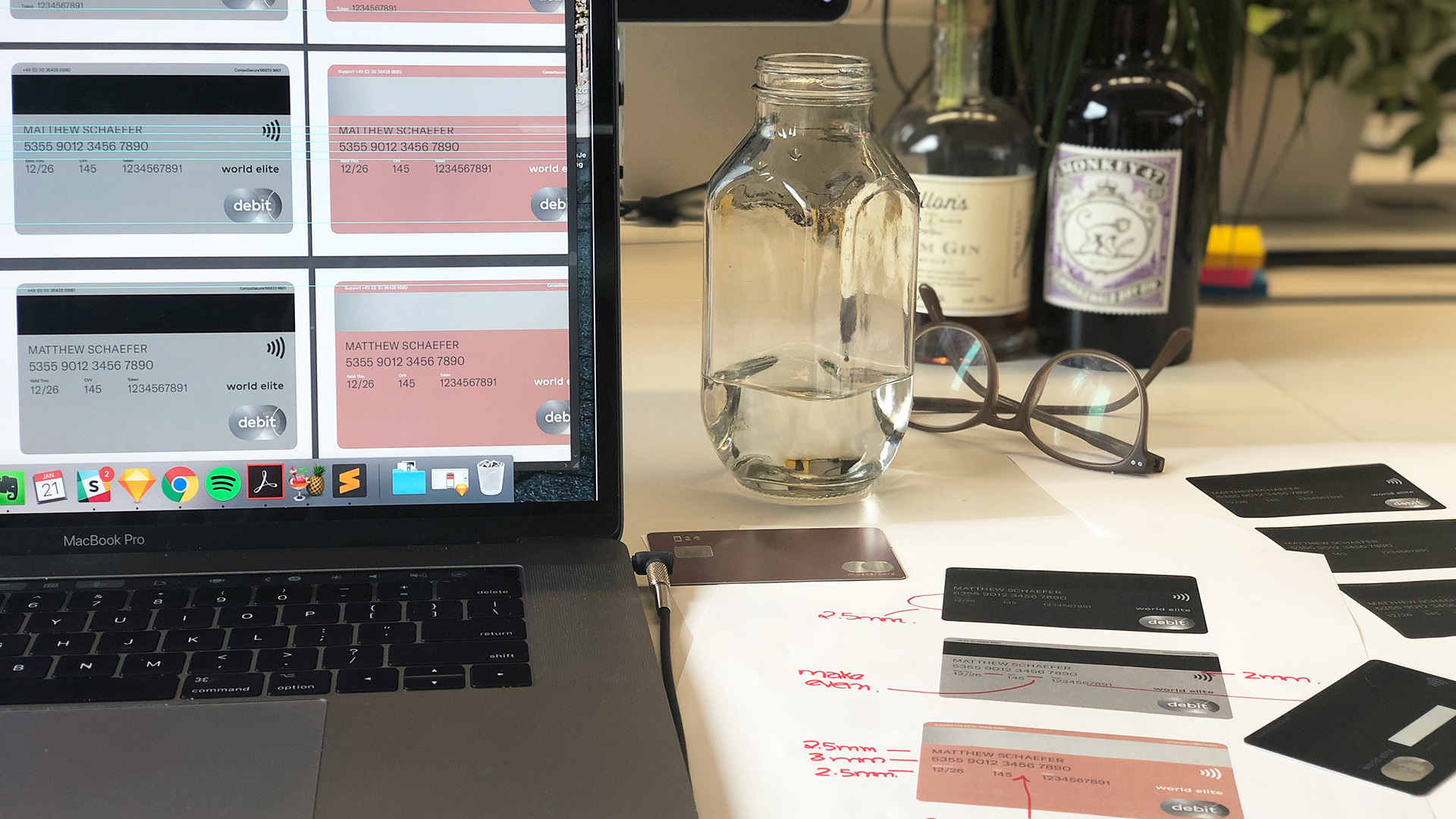
Card design wasn’t a priority in the finance sector, and with the rise in mobile payments, people hardly considered that there was something more to be experimented with. We took this as an opportunity, a physical connection to a fully digital product. The N26 card is the most tangible brand touch point and our goal was to elevate this experience creating a more intentional, multifaceted product offering.
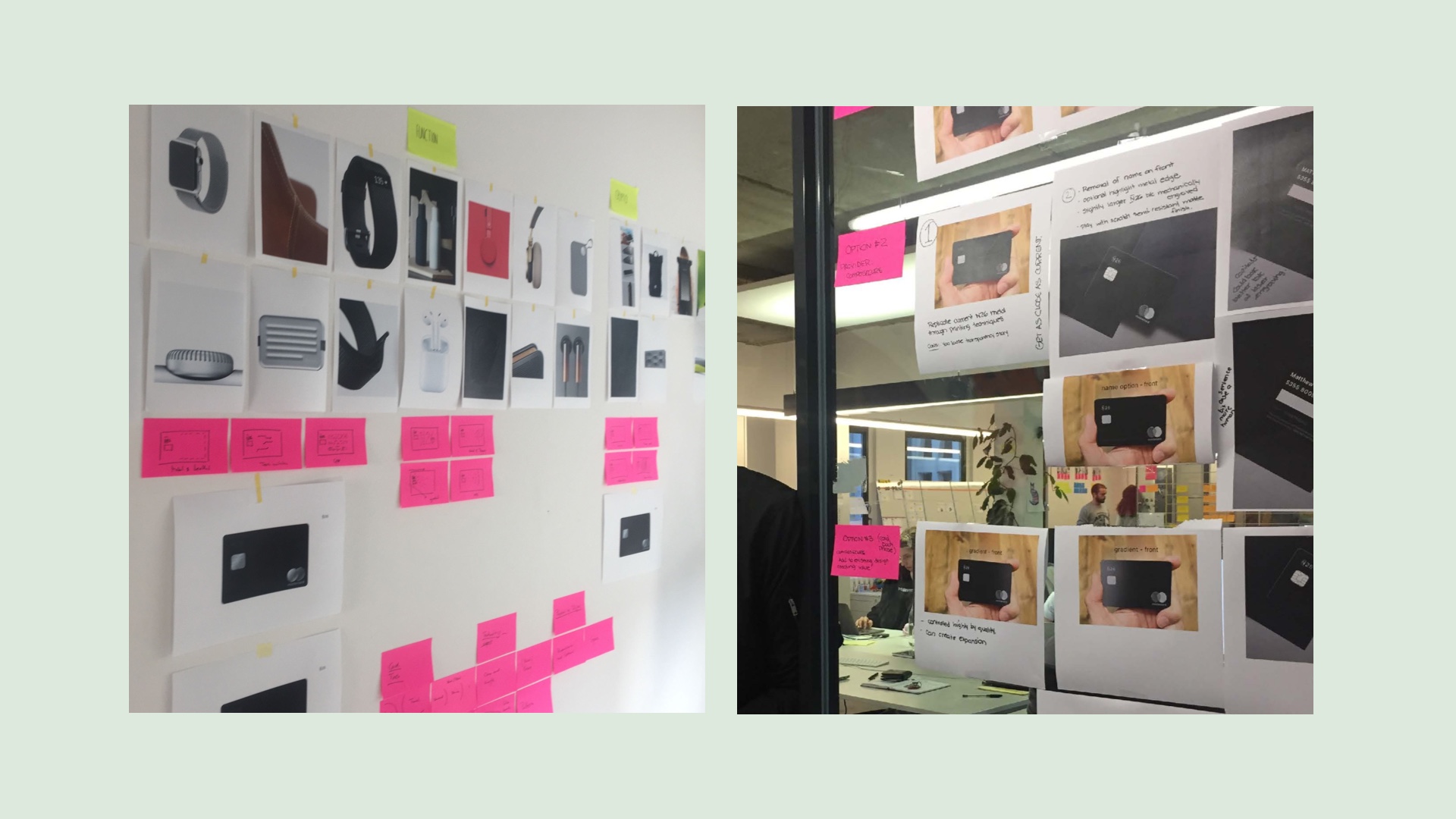
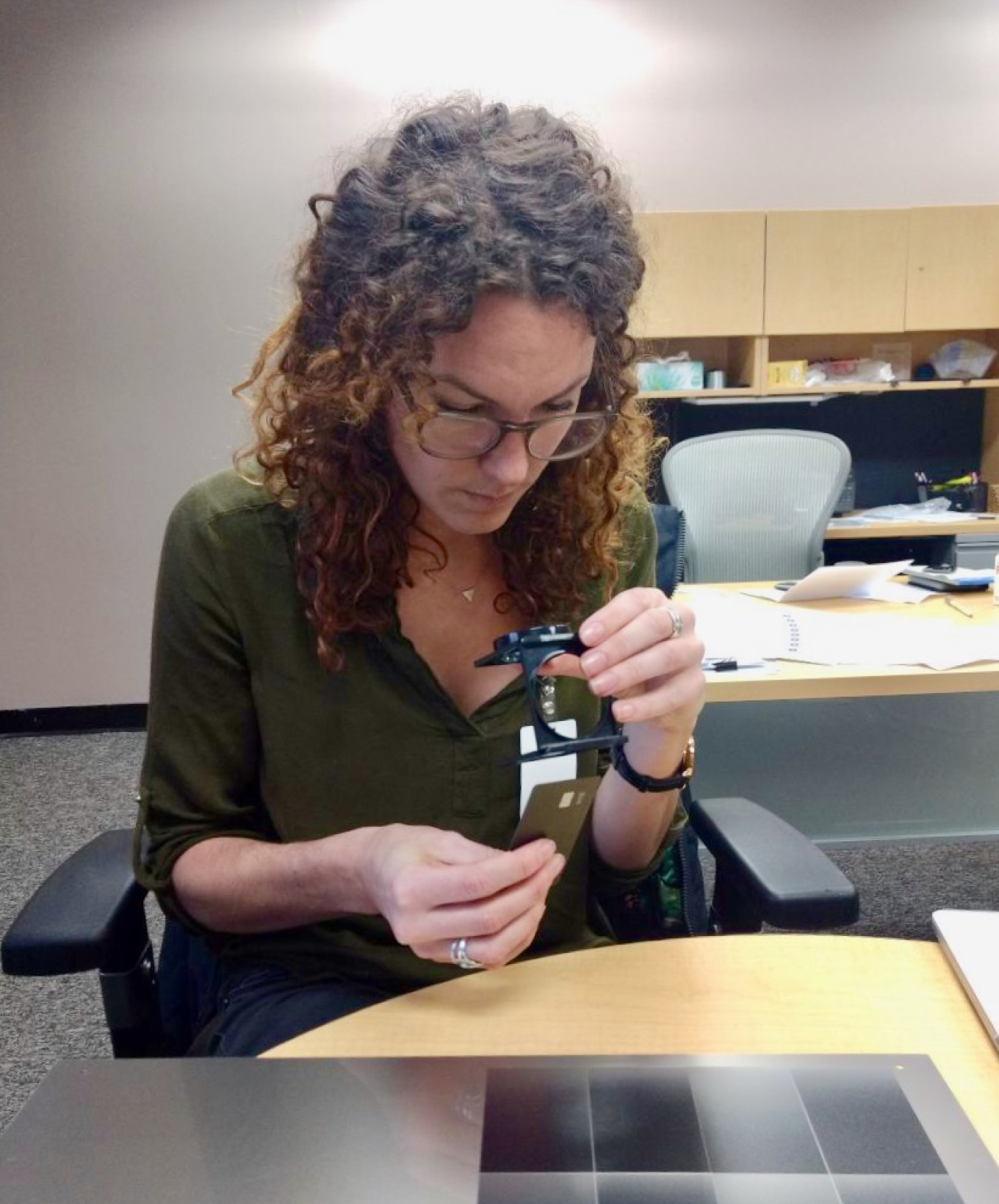
It didn't take long, researching financial institutions for us to realize that inspiration won't be found inside our sector. Instead, we collected physical products that our target audience resonated with. We then separated these objects into the categories of "Materiality", "Functionality" and "Accessibility". This was an important part of the design process. It helped us to understand the desired tactility, level of detail and behavioural functionality we looked to accomplish.
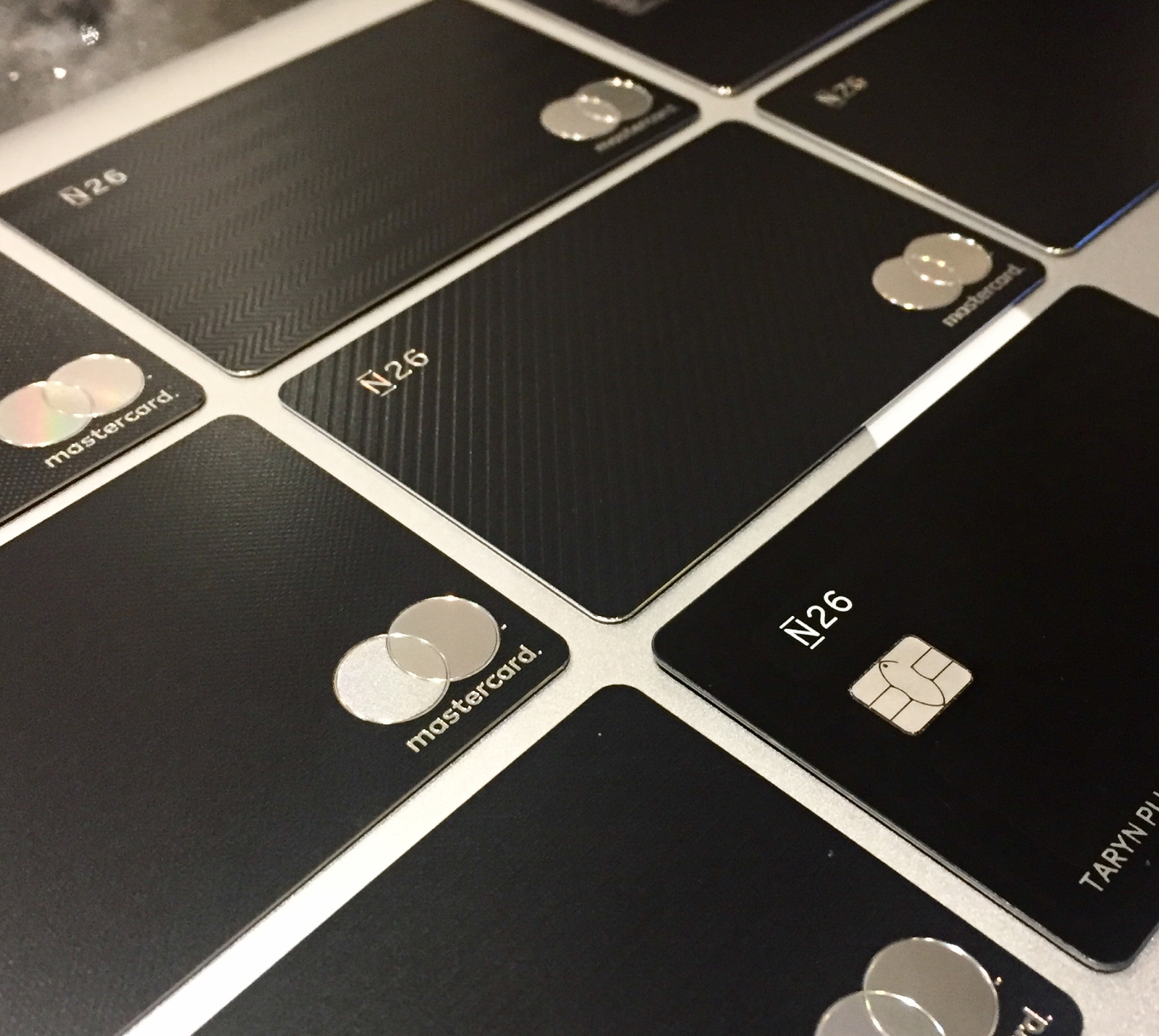
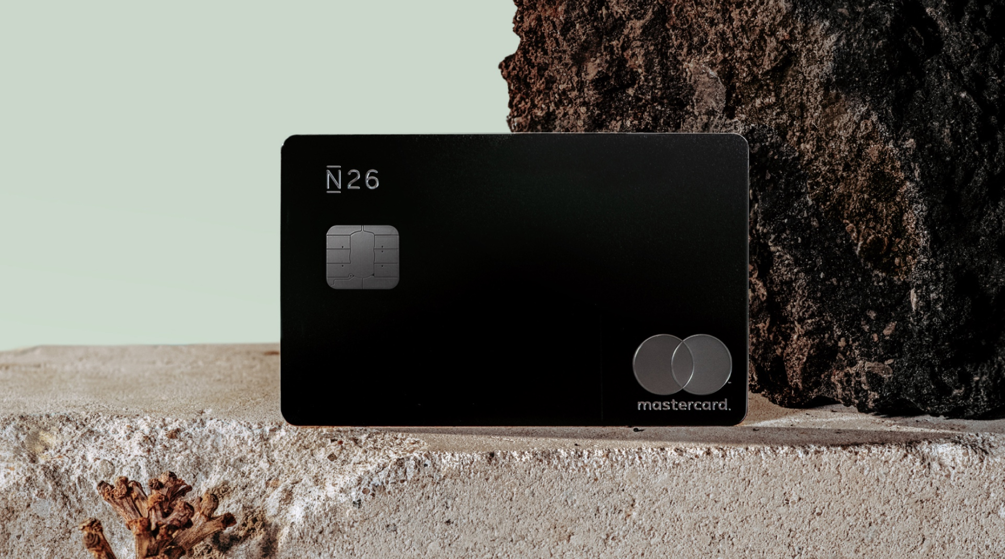
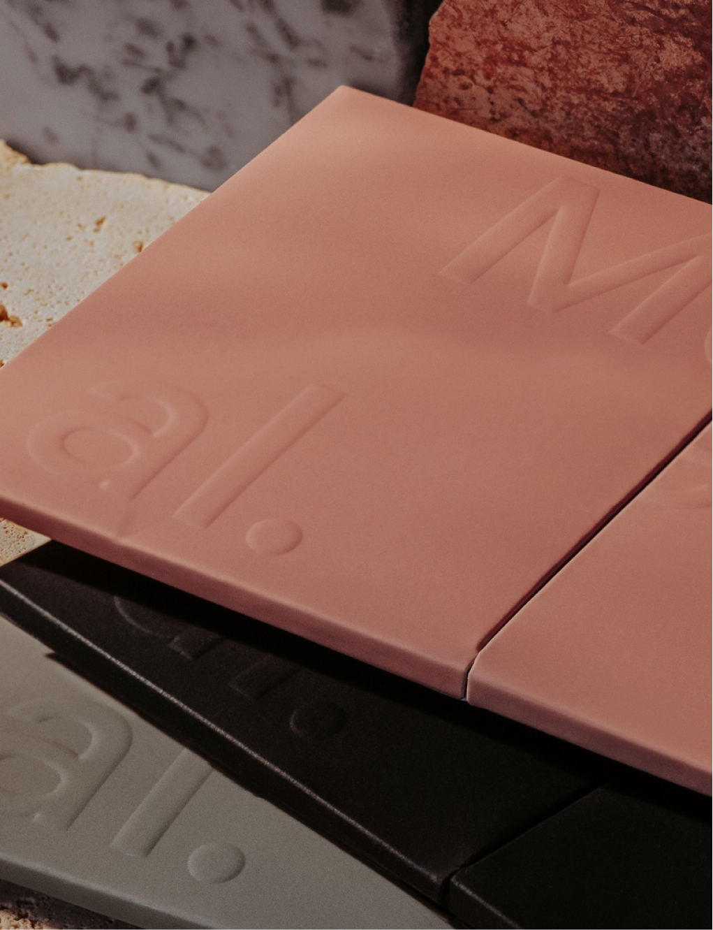
Ultimately, the final design decision reflected our core values. N26's promise to "simplify banking" was translated into our most premium physical product. Everything that wasn't needed was removed. We became the first bank card to place the name, phone number and personal identification numbers on the reverse of the card creating a clean, unobtrusive final result.
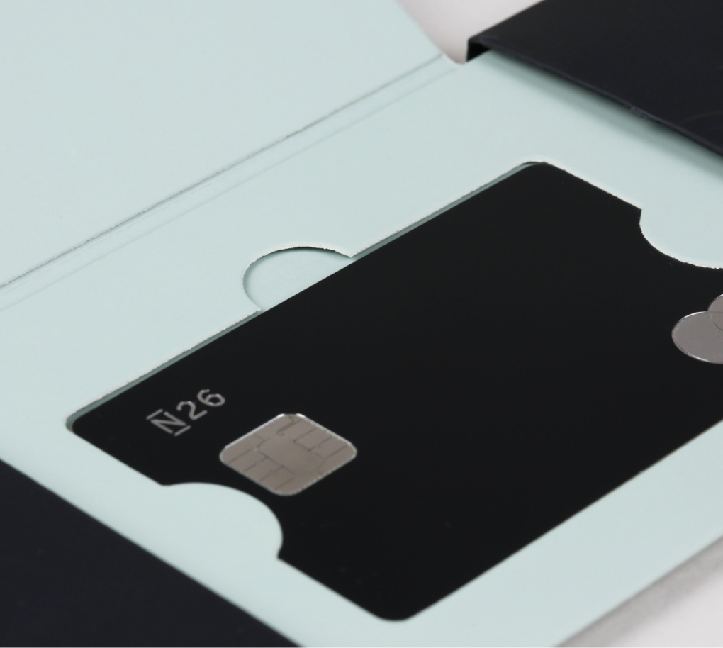
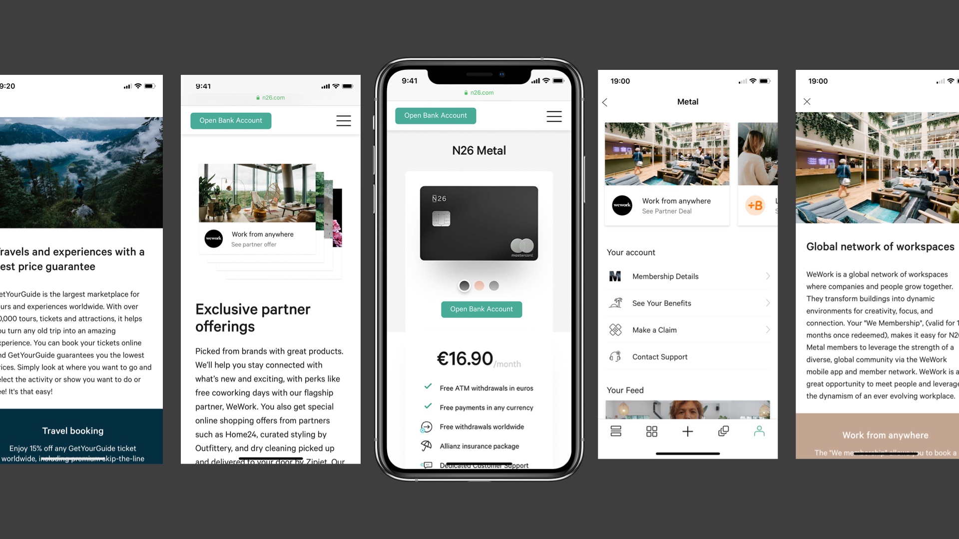
Working closely with other product designers and brand designers ensured our product held the same elevated approach across all platforms
As mobile payments dramatically increase we were working on how to digitally add value to N26 premium users. Three options that we came up with is making our card visually change based on phone movement in the Apple Wallet. The second is to add a custom haptic vibration when a payment goes through with a premium N26 card and thirdly to create an "Activate card" feature which is based on proximity of your physical card to your phone using RFID tags.
Taryn Niesena
Taryn Niesena
Berlin, Germany
taryn@niesena.com
Taryn Niesena
Berlin, Germany
taryn@niesena.com